brickly
product design, brand design
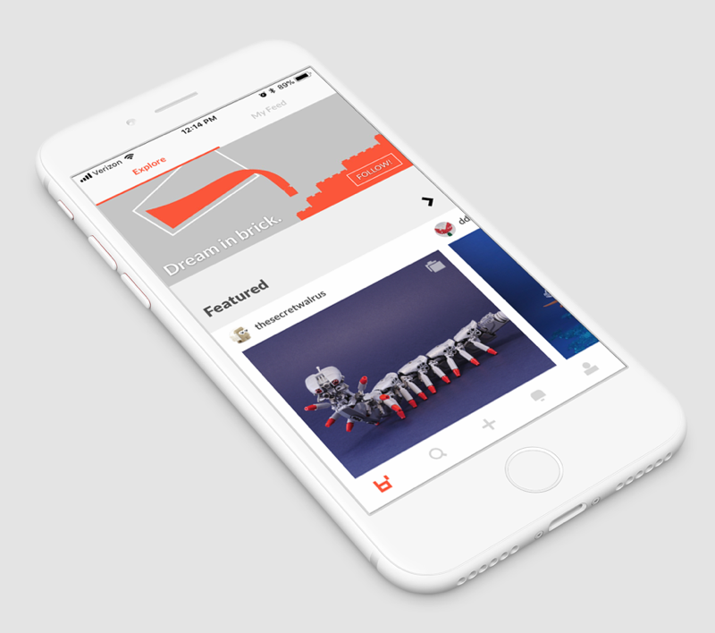
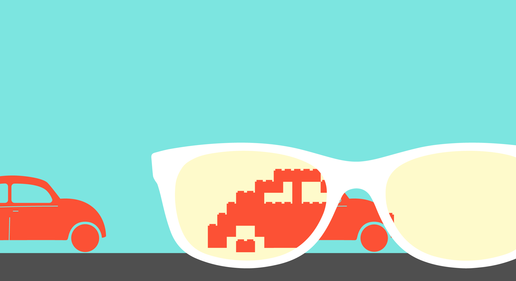
brickly was an iOS and web app that celebrated artists who would create amazing art out of bricks (aka LEGOs). brickly's mission was to legitimize and amplify the beautiful, creative work being done by the brick artists and community.
I worked on establishing a product design infrastructure as well as a brand language (both visual and verbal). Unfortunately, the company sunset after I had been there about 6 months.

goal
give brick artists a digital home made for them and empower them to bring their creations to others
role
I was the Lead Designer on a team of 5-6 people.
- product design
- product management
- visual design
- brand strategy
- illustration
team
Founder/CEO: Jordan Lim
Design: Rachel Costantino
Growth: Eric Mortenson / Aaron Tian
Engineering: Jorez Lopez / Eric Smith
shift information architecture (about 3 weeks)
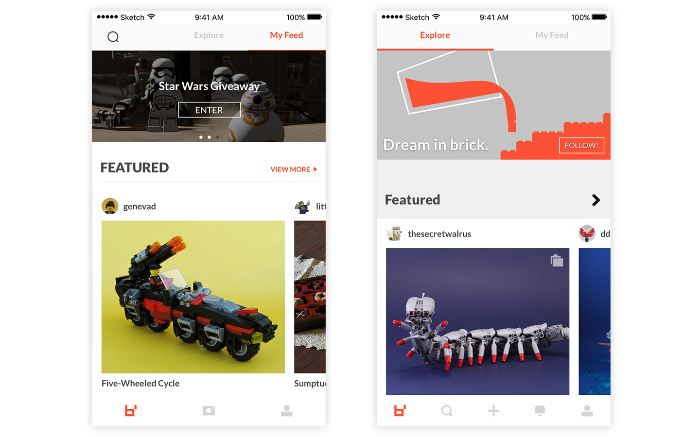
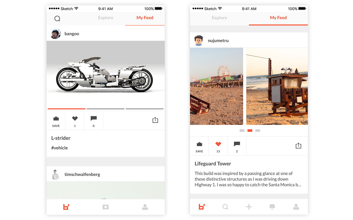
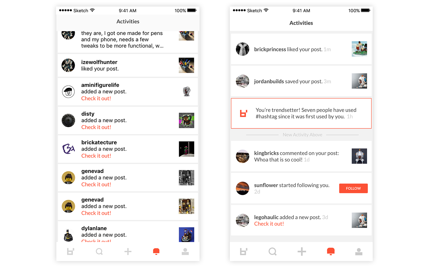
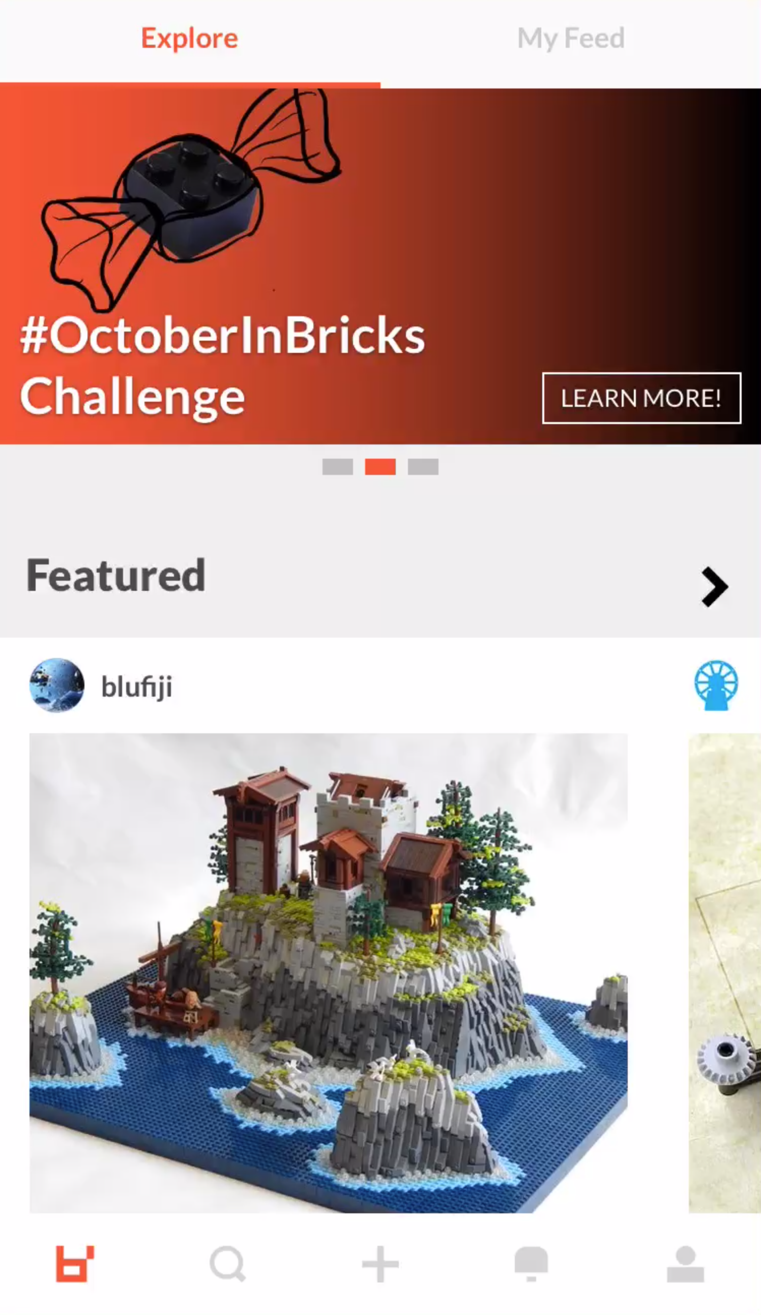
My initial focus was to establish and standardize UI patterns, to restructure the navigation and UX in order to allow room for growth, and to develop a start to a design system. Below are 3 slides that compare 3 of the main screens — the left side shows the original screen and the right side shows the updated version.
ux / ui adjustments to tab bar and navigation
The original product roadmap planned for new features that would not be accessible through the navigational paradigm of the soft launch version. In order to future-proof for these new features, I moved the search icon to the tab bar. This also allowed the search screen to evolve and grow to include a discoverable/browse feature.
Several UI updates were made in order to help the organization of the curated Explore page (title treatments, more consistent buttons and color use, multi-image indication icons, and backgrounds to separate collections). Additionally, I changed the Camera icon to an Add icon as the camera is not accessible via the app and it was misleading.
experience & enhanced feature overview
(appox 2 months total)
I looked into tweaks to help with basic features, like uploading images, creating a post, threaded comments, and activity notifications. I also spent some time setting up the start of a design system.
The video to the right is a screen recording of the shipped app as of November 2017.
challenges feature (not shipped) (about 3-4 weeks)
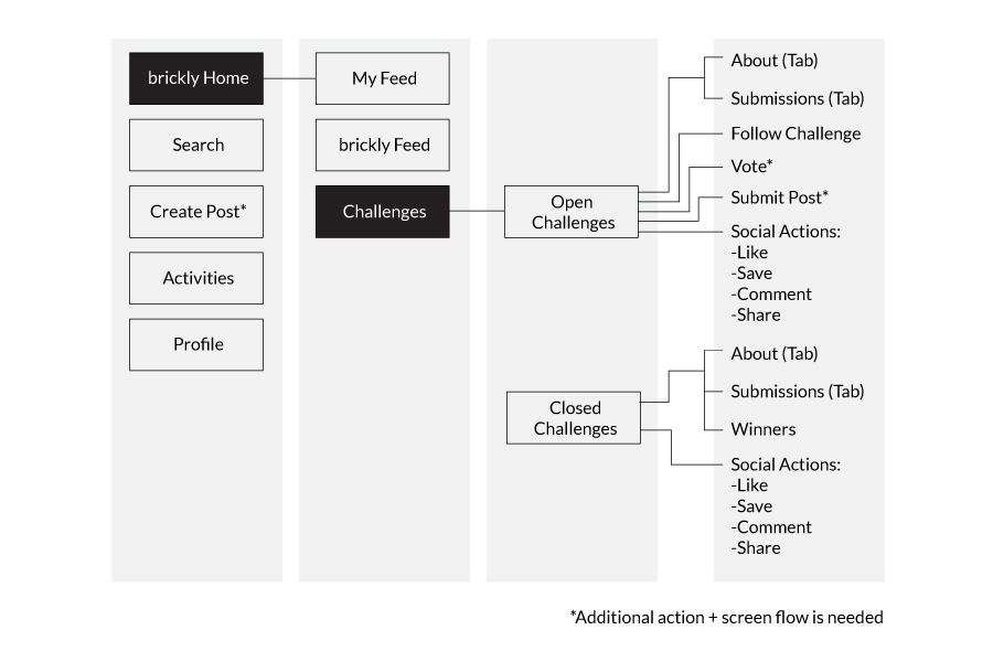
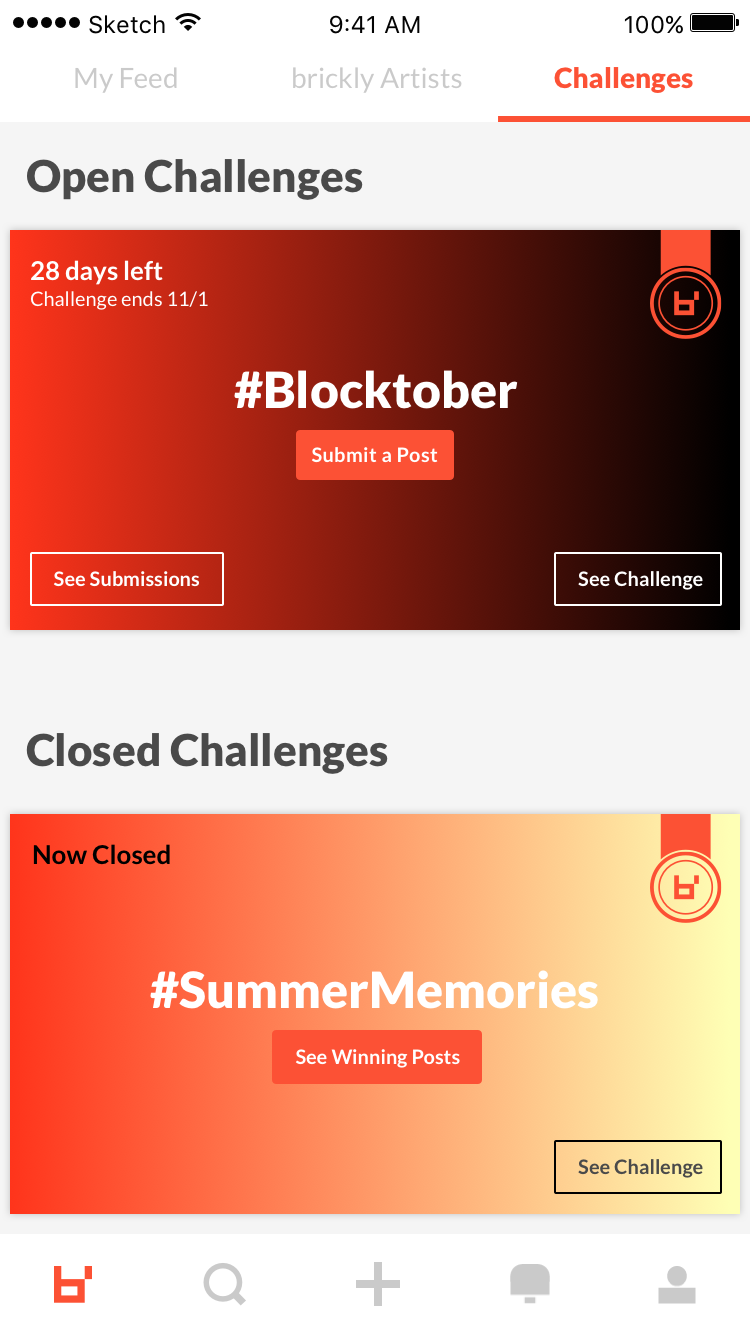
Before the company closed down, we were working on a new feature called Challenges. We ran a two month long test for this feature via social media. I created campaigns to encourage people to participate.
The Challenges feature was a way for us to start to involve those consuming the content, not just those who make it. The end goal was to have a custom set physically made based on the popularity of winning builds.


post view redesign (not shipped) (about 2 weeks)
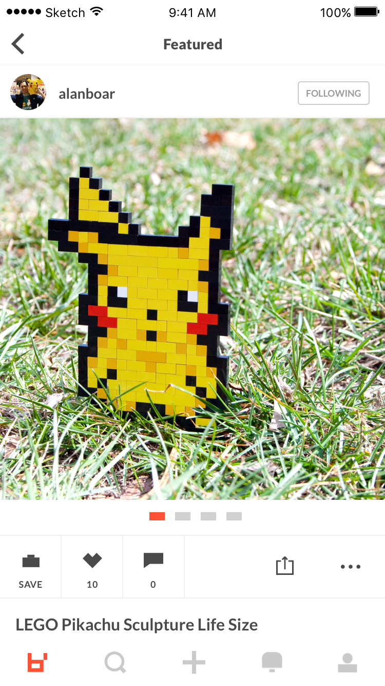
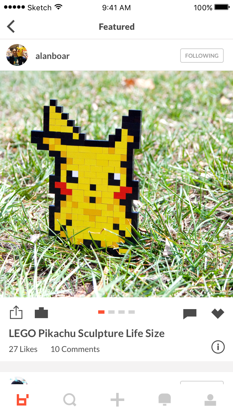
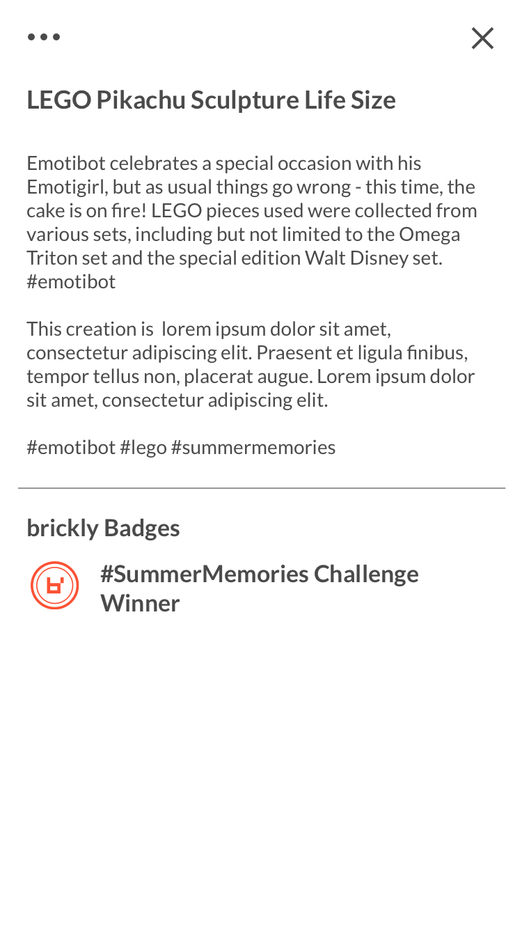
Due to the nature of the work being posted, the current format of our posts did not do the work justice. The images were too small, there was no ability to zoom in on the work, and there was no space to highlight any merits an artist may have won with that build (i.e. through Challenges). Below are the states I investigated as a next iteration to address those issues.
production layout
redesign mock ups
goal for web app
provide access to brickly for those who either don’t have iOS or prefer desktop experiences
insights into our user base
When I first started, there was minimal research documented about our user base but one fact became clear very quickly — majority of our users didn’t have iOS. Our app, at that point, was only accessible via iOS. This meant that our artists didn’t have access to the platform to even post their work, let alone use the app. First goal, allow artists to create posts as soon as possible.
Creator Web App (about 2-3 weeks)
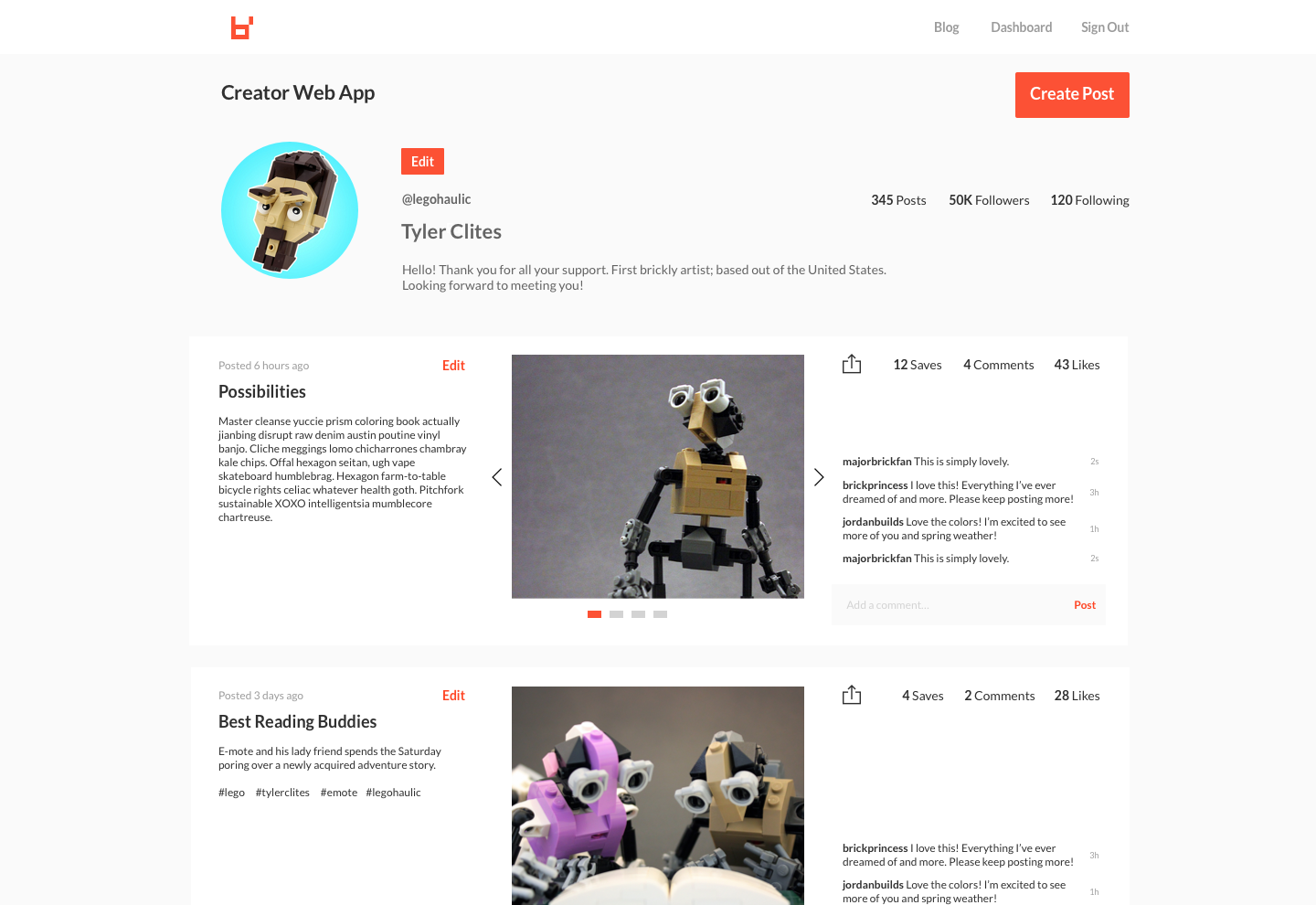
About two weeks after I started, we launched this basic admin portal that allowed artists to create posts and view their posted work.
read-only Creator Web App iteration (about 3 weeks)
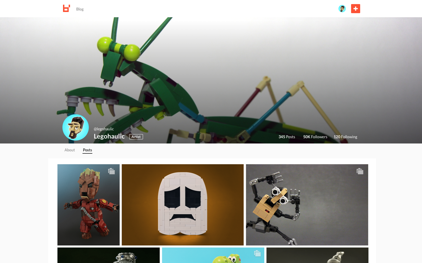
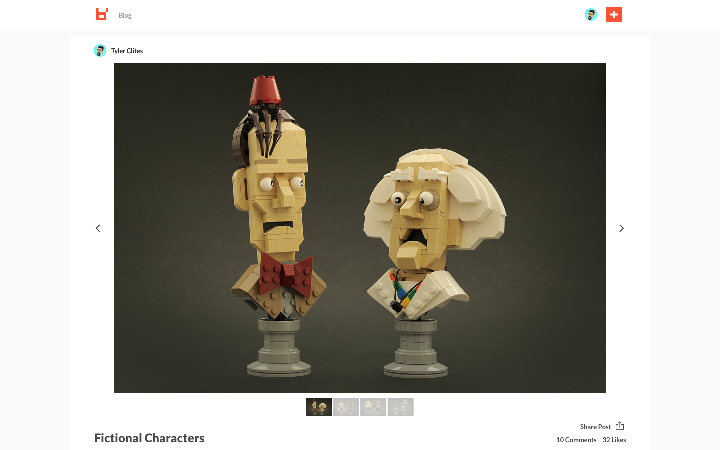
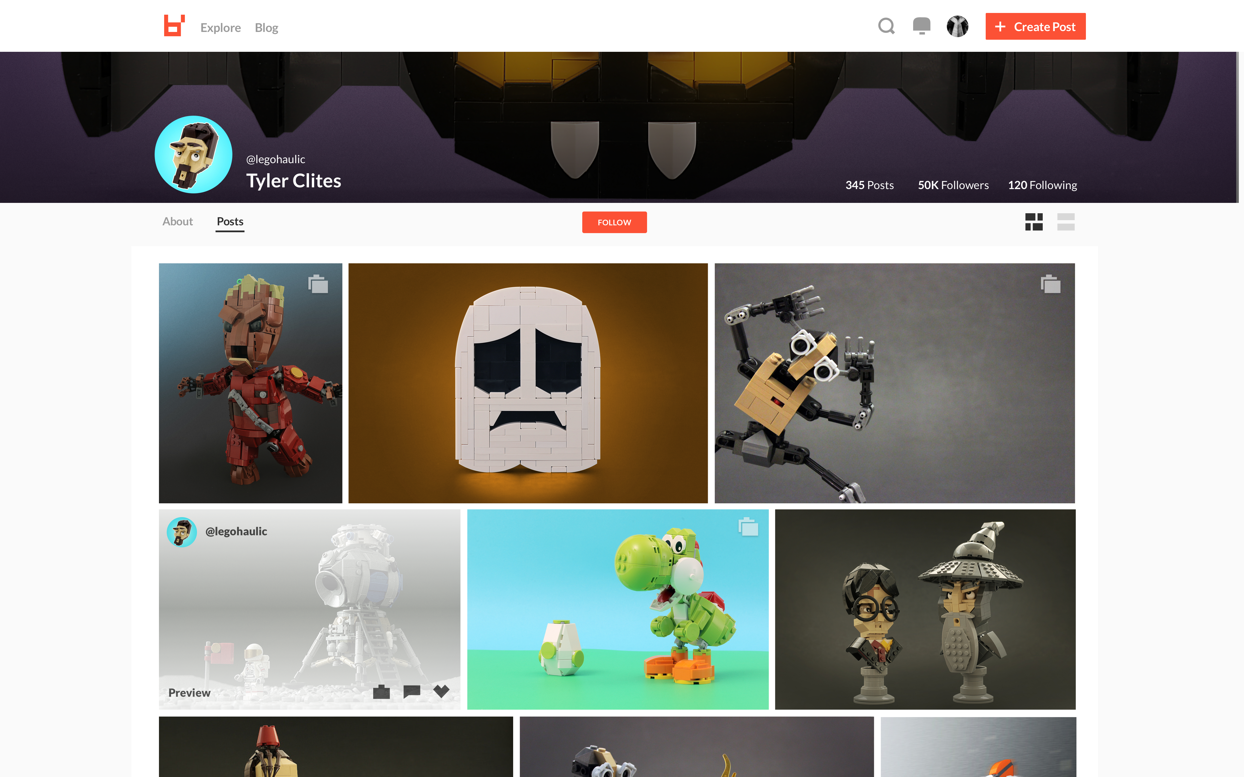
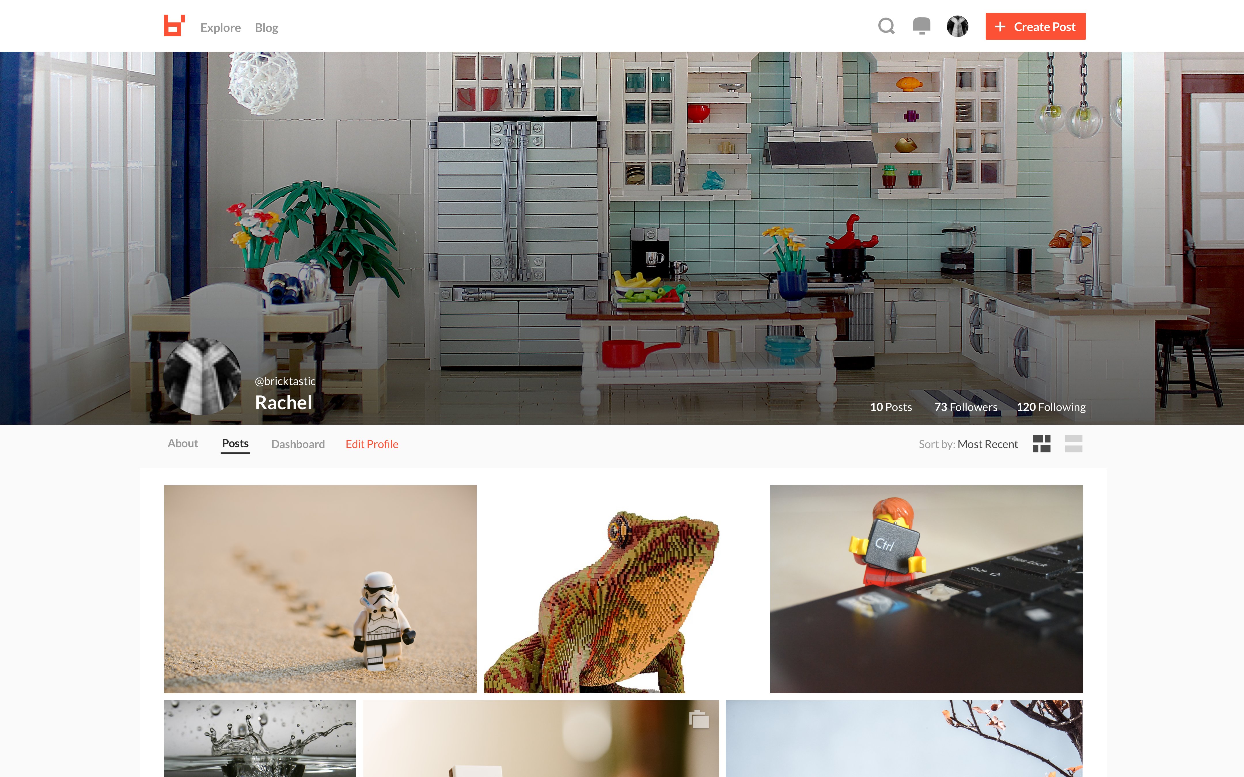
Our last sprint as a company was focused on getting a read only version of brickly up on the web app. Below are the two screens that were shipped.
full functionality Creator Web App (not shipped)
(about 4-6 weeks)
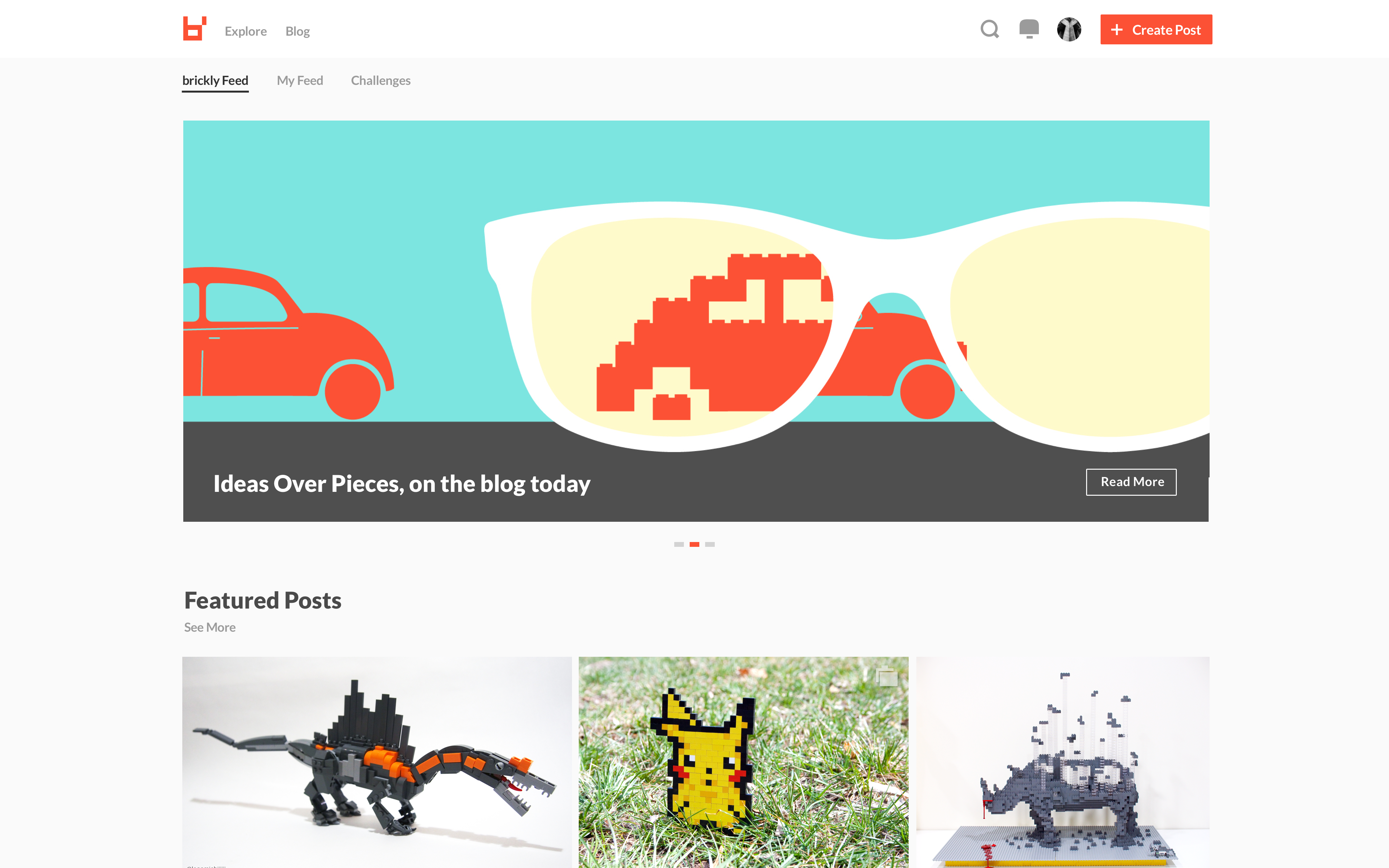
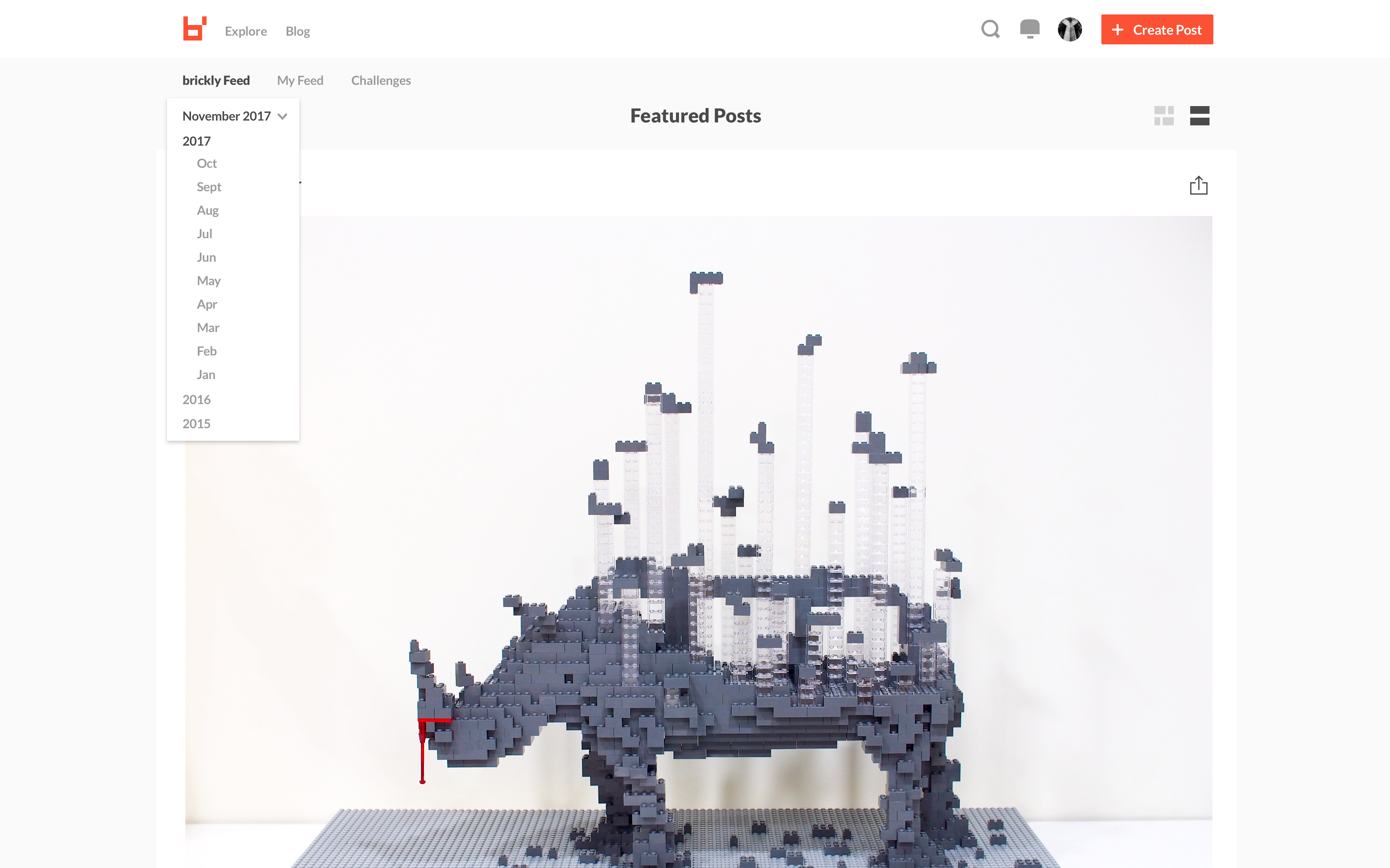
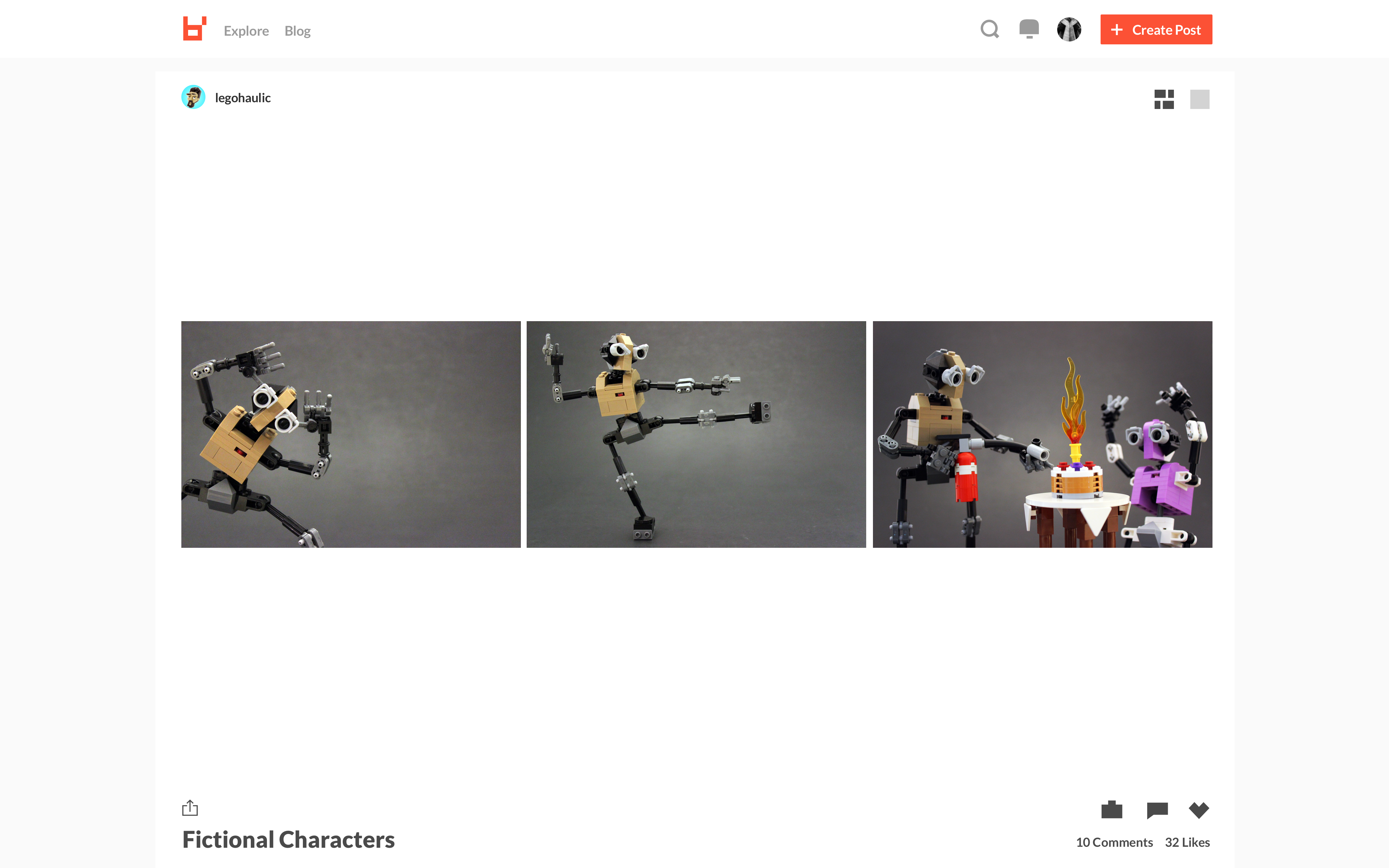
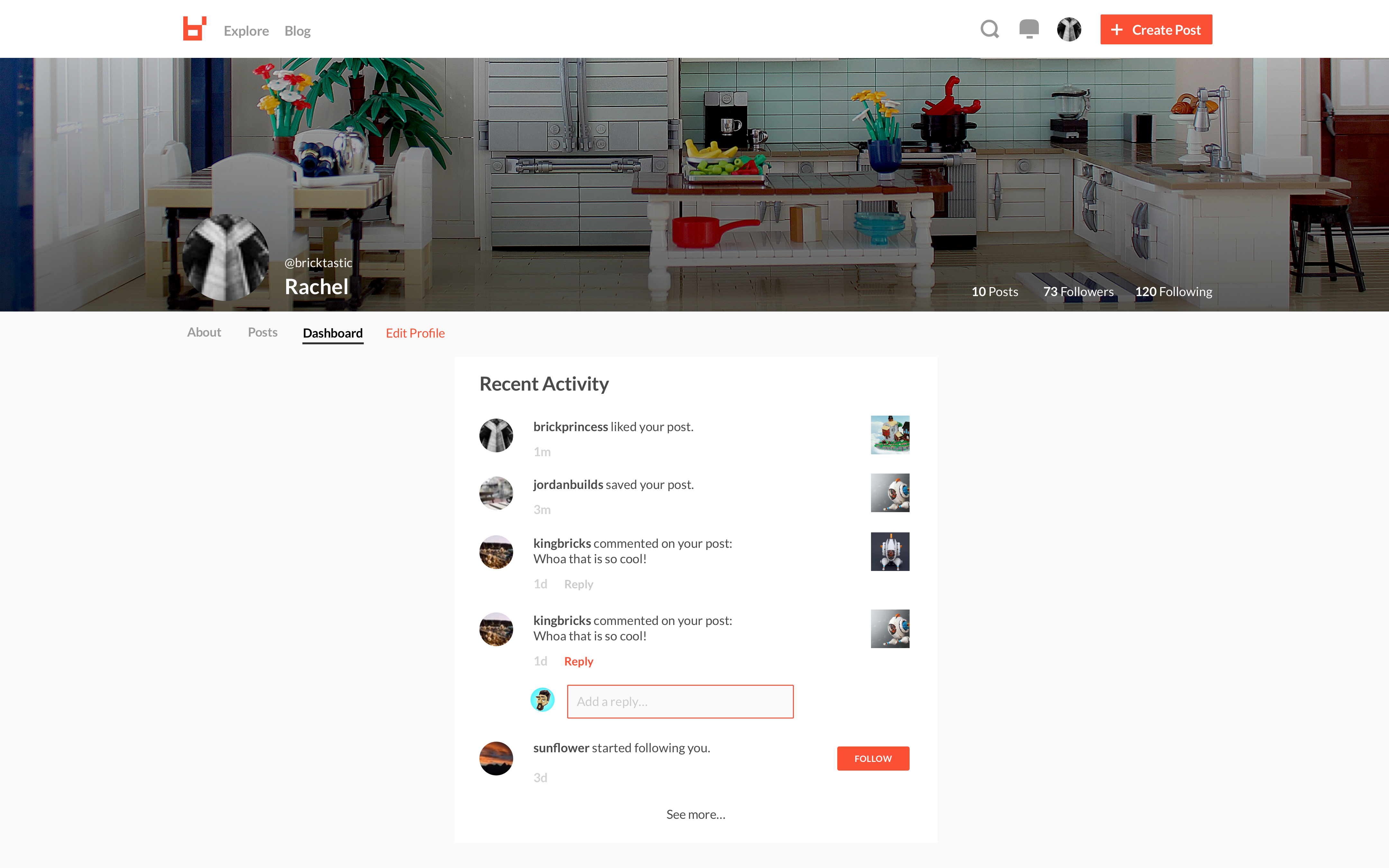
The next two sprints were intended to ship the interactive portions of the platform to allow a fully functional brickly experience for all users, regardless of mobile device. Below is a prototype of the experience.
visual + brand design goal
give brickly a voice, a point of view, and life through visuals and content


Thanks for checking out my work with brickly!
Selected Works
Wade & Wendy: Product Strategy & Visionproduct strategy, ux, animation
Wade & Wendy: Workspaceproduct strategy, ux, product design

Wade & Wendy: Internal Toolingproduct strategy, ux, product design

bricklyProduct & Visual Design
MXD (concept)product design, business design, strategy
Motionvideo editing, animation

Letteringhand lettering, illustration